Daily Painting
»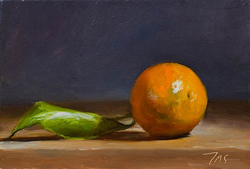
Clementine and leaf
18cm x 13cm (7"x5"), oil on Masonite
Painting status: SOLD
Painted Tuesday, 21 December 2010 · Still life paintings
Daily Painting
»
Painting status: SOLD
Painted Tuesday, 21 December 2010 · Still life paintings
The conversation
Thoughts on this painting
12 comments
Julian - wanted to wish you Peace and Joy this winter Holiday - and to say how much I enjoy seeing your work - the quiet vision and incisive brushwork and color are reminders of how wondrous the natural world can be. DTD
These still lifes remind me of Chardin - gorgeous work!
I'm glad it escaped. It needed to be singled out for star treatment.
Orange and blue may be my favorite complementary pair.
Ah Ha .... now we are painting LEFTOVERS .....
I don't generally like 'them' but this one is good.
Thanks again, suzy
Beautiful work as usual, Sir!
an escapee! captured by your brush and wonderful artists' eye...lovely.
Julian,
what an incredible painting. the use of light and values is amazing.
A treat to see.
Tish.
superb!
Sir, it is strange that the shadow on this most excellent painting indicates that the source of the unidirectional light is shining from the right hand side, yet the highlights on the orange and leaf indicate it should be shining just 10 degrees from the right of the viewer, or almost 90 degrees to the angle of the light source described in the painting. Can you explain this phenomenon?
I can take a photo of it if you like, it's still here in front of me. The light source, a lamp, is about 45° above the clementine and almost directly right (stage left) of the set up. As always in light reflected from an object, though this is not a billiard ball, a line from the viewers eye through the highlight will give you the position of the light source. Hope that helps.
Thank you Julian, that explanation works well with me, no need for a photo, I have issues with how my paintings are lit and can see that my question has quickly become obselete, now you have explained the light source. Many thanks.
excellent. can't say more. yes I can, I like the contrast between the orange and its complement color blue in the background. It works so well.